World of Color: Ultramarine, Aqua, Turquoise, Lapis, Cerulean, Indigo, Prussian, Cobalt, Egyptian, Navy…Oh My

Since you all like this series so much, I thought I’d dive into blue. As you can see from my inexhaustive list above, this could get me into treatise territory. Research by the Crayola Company, college professors and others have shown time and again that blue is our favorite color.  They believe our blue love comes from clear skies and oceans, two inspiring features of Earth.  Generally, our favorite colors are hues we associate with positive emotions or beautiful things from Nature. I’m not sure why the expression “feeling blue” means we are sad if we love blue so much, but onward.

In Renaissance art, blue was associated with spirituality and the Heavens (there’s that sky again.)  In the history of art, blue pigment was unavailable until, 6,000 years ago, when lapis from the Afghani province of Baluchistan was ground into pigment and transported via the Silk Road over thousands of miles. For many years, blue pigment was the most valued resource on Earth. Due to its scarcity, blue ascended to symbolize divinity, wealth, power, and purity.   Some well-known painters in different centuries favored blue as a central color: Van Gogh in his “The Starry Night” uses blue to suggest movement of the heavens as a metaphor for the soul.  Johannes Vermeer modifies ultramarine to soften the hue into shades likely found in the home. Giotto, covers the ceiling of the Scrovegni Chapel with ultramarine, a lavish use of this costly material.
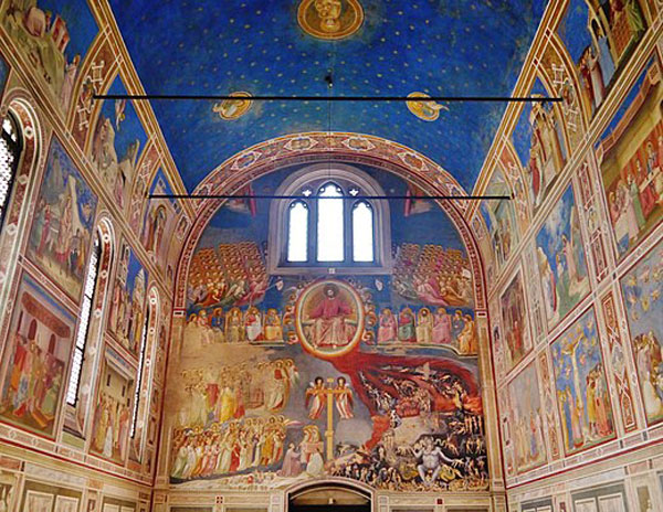
GiottoPadova Cappella
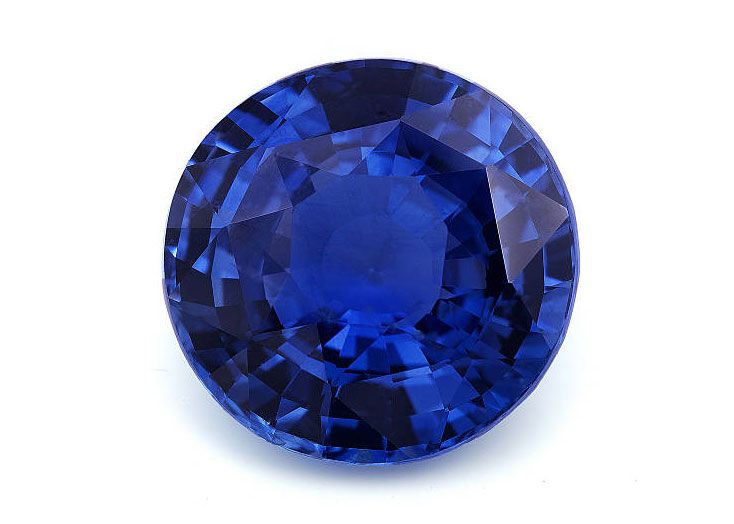
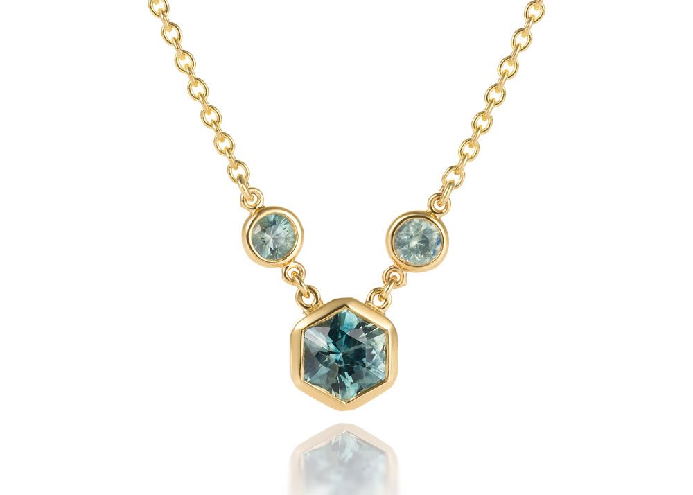
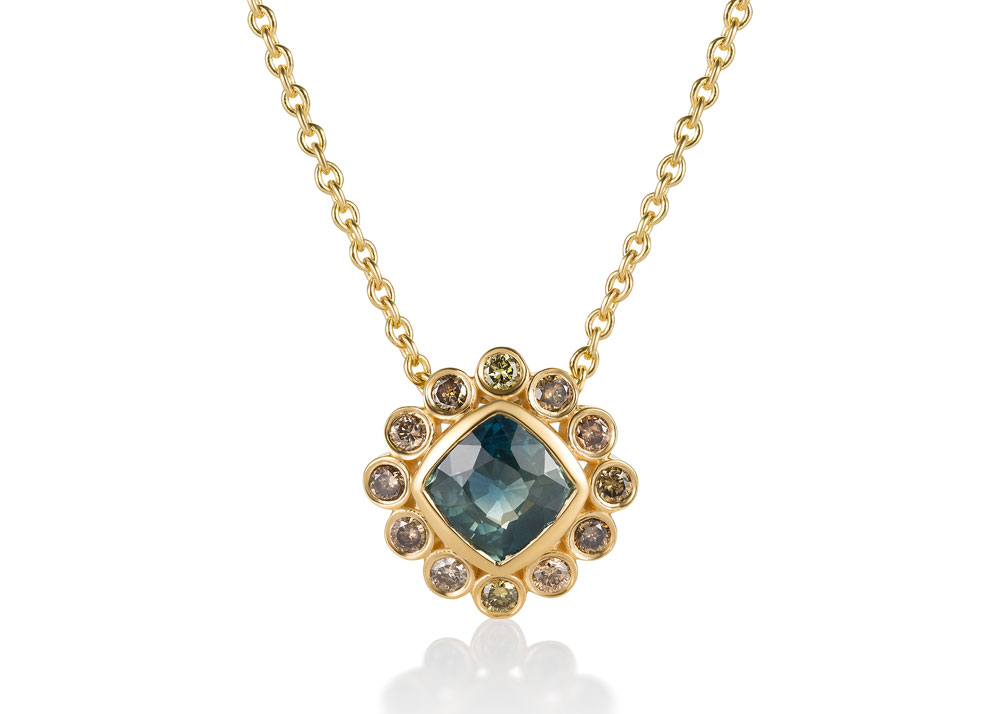
In the jewelry world, blue dominates the preference landscape, too. I mean, who doesn’t love a deep blue sapphire, a watery light blue sapphire or a greenish blue aquamarine? How about blue pearls, the rarest pearl color? Mm hmm… I thought so. Sapphires are loved for many reasons, of course, including durability for daily wear. But I digress.
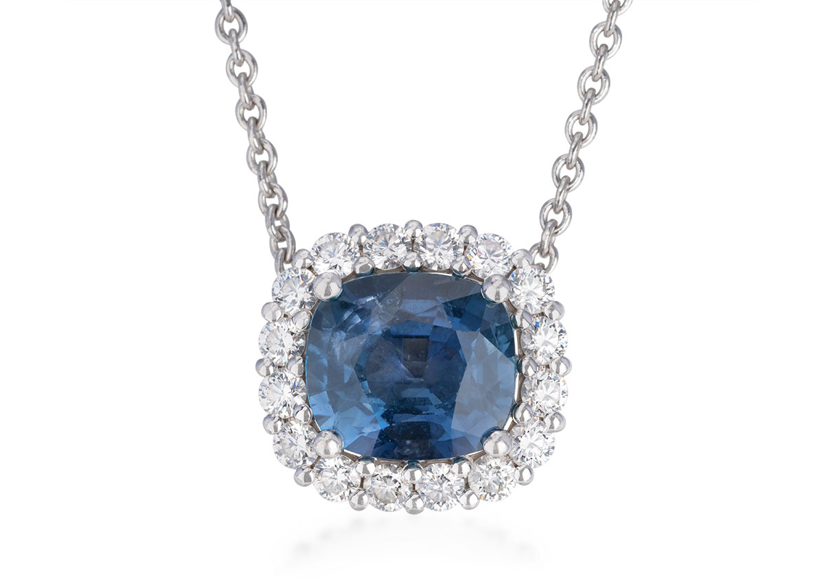
blue sapphireBurma

Do you have a favorite blue? I’d love to know.

Stay cozy!

Diana

World of Color: Confident Orange

Next up in our color line is orange. I chose it because Pantone’s “color of the year” is “Fuzzy Peach,” which they describe as “A shade that resonates with compassion, offers a tactile embrace and effortlessly bridges the youthful with the timeless.” I would love to join their color committee to ascertain the process for choosing and creating these lofty color descriptions. Since I don’t know how many of us really love fuzzy peach, I thought I’d expand the color to include Orange.

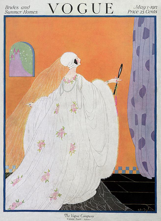
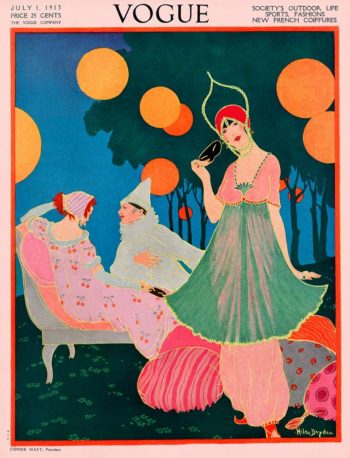
Orange as a color name only emerged in the 16th century. Before that, it was referred to as “yellow-red.” Orange was described by Wassily Kandinsky, the Russian abstract artist, as “red brought nearer to humanity by yellow.” In the 1920’s, Helen Dryden illustrated many covers for Vogue Magazine using orange as a background highlight. See the two examples here.

BlogOrangeVoguecover1

BlogOrangeVogueDryden2

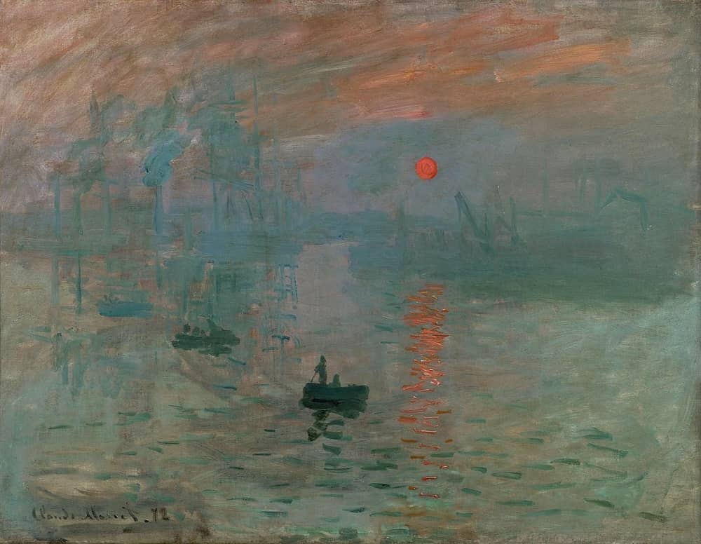
Orange adds playfulness and beautiful contrast with the complementary cool colors, so it is often used as an accent. One source tells me that Claude Monet’s work “Impression, Sunrise,” gave the Impressionist movement its name. In this painting, he uses an orange sun as the focal point.

BlogMonet

Orange is confident, vibrant, urgent, commanding. Think of the rusty orange of the Golden Gate Bridge (whose shade is called GGB Orange,) which creates the iconic contrast with the blue water and sky surrounding it. How about orange warning signs for traffic, and emergency worker vests? Did you know that “black boxes” on airplanes are bright orange to make them easier to locate?

I didn’t.

In Europe, the influential House of Orange brought the color into vogue and the Dutch use it as their national hue.

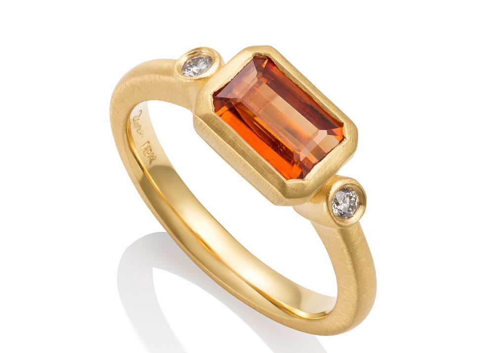
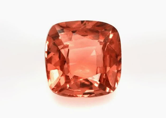
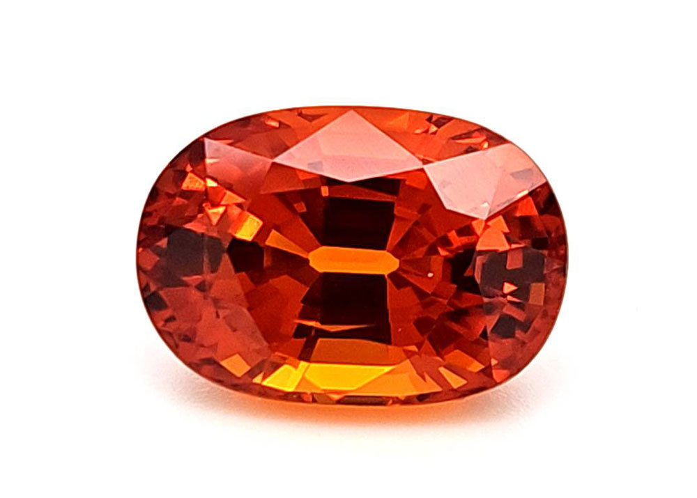
Getting down to gemstones, we have some spectacular oranges in the garnets, diamonds, sapphires, and “fuzzy peach” tourmaline. Take a look at these photos and come see me for your elegant orange jewelry pieces. It just so happens, I have a gorgeous stash of orange garnets here… but, of course, you already know that.

OrangePadparascha
OrangeSpess

Hugs from the studio…

Diana

World of Color: Green… Color of Growth and Envy

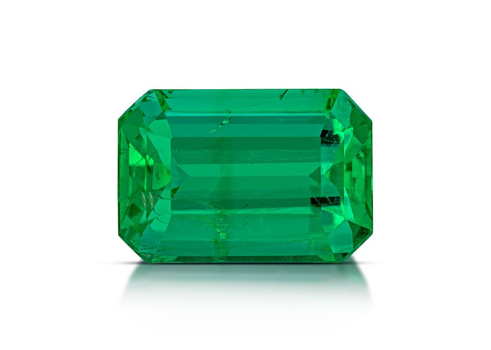
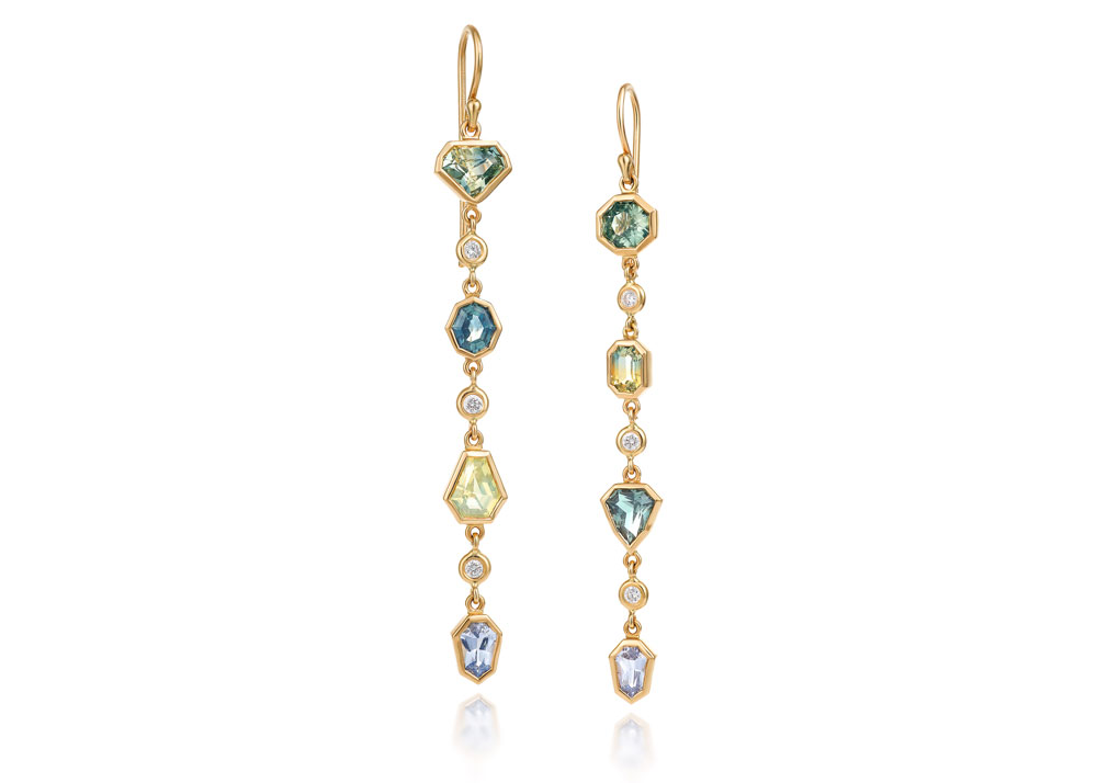
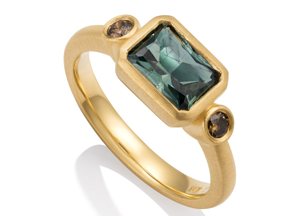
Green is one of my favorite colors.  Spring green lights up the world after a long dark winter. Spruce green, a grayish-bluish-green, is soft on the senses and quietly elegant. Emerald green, rich and focused, satisfies a gazing gem geek. If you’ve been a long-time reader of this journal, you know that I always marvel at nature’s provision of color in all her creations: green water, green gems, green plants and trees…   I’ve been working with watery and rich blues and greens for a long time as these hues occur most amiably in Montana sapphires and “parti-colored” sapphires shown here. A fine peridot has no equal for its grassy green hue.

MultiSappLine EarringGreen sapphire ring
The Romans believed green to be restful to the eyes. They pulverized emeralds (ouch!) and used the dust as eye balm. It is said that Emperor Nero was besotted with emeralds and had a vast collection. He even used the larger ones as a prototype of “sunglasses” saying they made it easier for him to see the gladiators in the blinding sun over the Circus Maximus.

Shakespeare gave us “green-eyed jealousy,” in” The Merchant of Venice” and a “green-eyed monster” in “Othello.”

Don’t forget the Wizard’s Emerald City-- a place of dreams and possibility.

In the metaphysical world, green is associated with growth, renewal, and rebirth.

Best regards from the studio and think green thoughts!
Diana

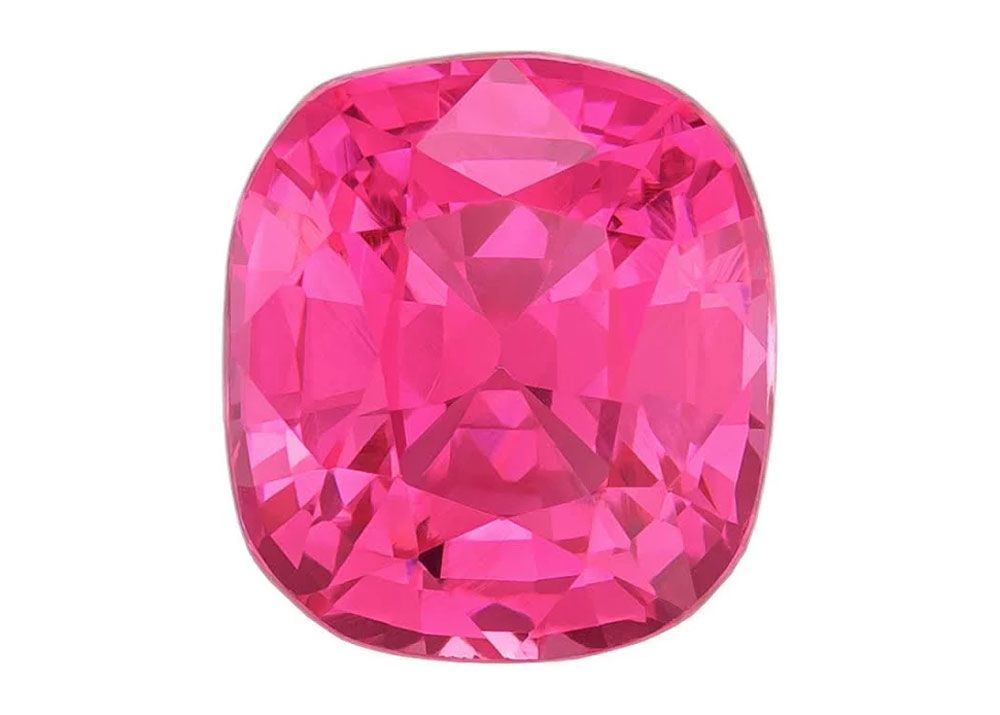
The World of Color: Shocking Pink

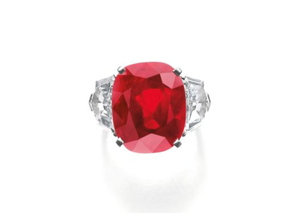
When I learn fun things, my first inclination is to share with you.  I had no idea that the name for this beloved shade of pink actually came from the mouth of designer Elsa Schiaparelli when she described a 17.67 carat diamond Cartier ring owned by Daisy Fellowes. The story goes that Daisy, the only daughter of Isabelle Blanche Singer of sewing machine fame, was known as a transatlantic social tornado in 1920s and 1930s Paris and New York.

ShockingPinkDiamond


She had a penchant for shopping and, one day, turned up at lunch with Elsa wearing the above-mentioned Cartier hot pink diamond ring. Schiaparelli had never seen such a color and fell irretrievably in love.  “The color flashed in front of my eyes,” Schiaparelli later wrote, “bright, impossible, impudent, becoming, life giving, a color of China and Peru but not of the West, --a shocking color, pure and undiluted.” And there we have it. Shocking pink.

Schiaparelli immediately incorporated the color into her new perfume, which she named “Shocking.”  The packaging was hot pink and the bottle shaped to emulate Mae West’s voluptuous figure.

One more fun fact about hot pink: Marilyn Monroe wore a hot pink dress with a big back bow when she sang “Diamonds are a Girl’s Best Friend” in the movie “Gentlemen Prefer Blondes.”

In the pink,
Diana

Happy New Year: From the Mundane to the Sublime

Hi, everyone! I hope this finds you off to a good start for 2024, either in the tropics or at home curled up with a good book. I’ve just finished “Covenant of Water” by Abraham Verghese and highly recommend his brilliant writing.

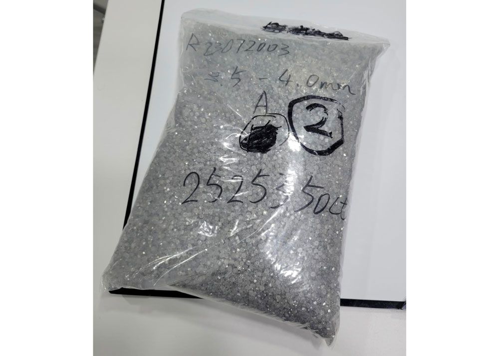
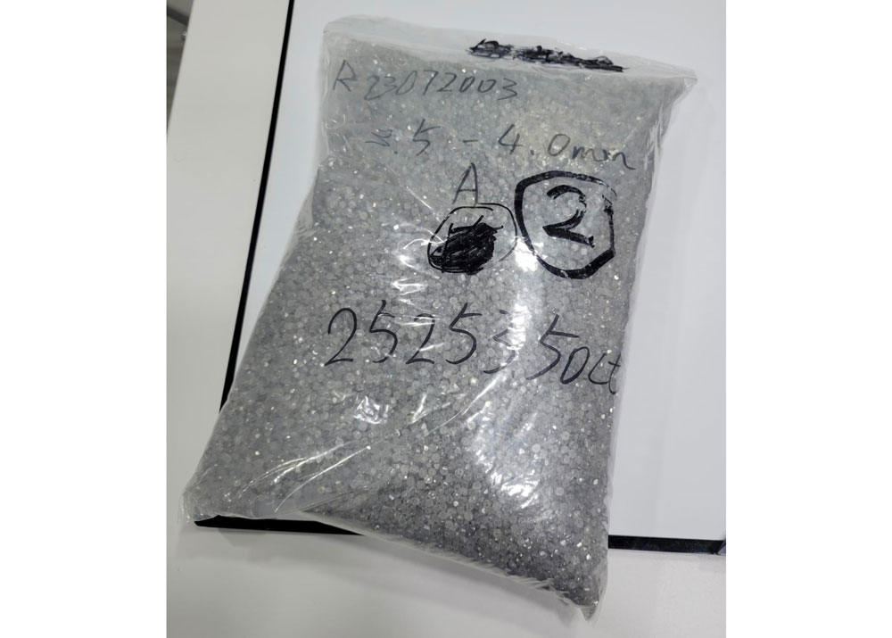
This morning, one of my colleagues posted a photo of a plastic bag filled with 250,000 carats of small diamond “melee,” the tiny gems that add sparkle to your pieces. These itty-bitty things are full cut diamonds, not chips and I laughed when I saw this grayish bag of stones. So plain yet so beautiful when set.  It’s all about potential, isn’t it?  

DiamondMelee

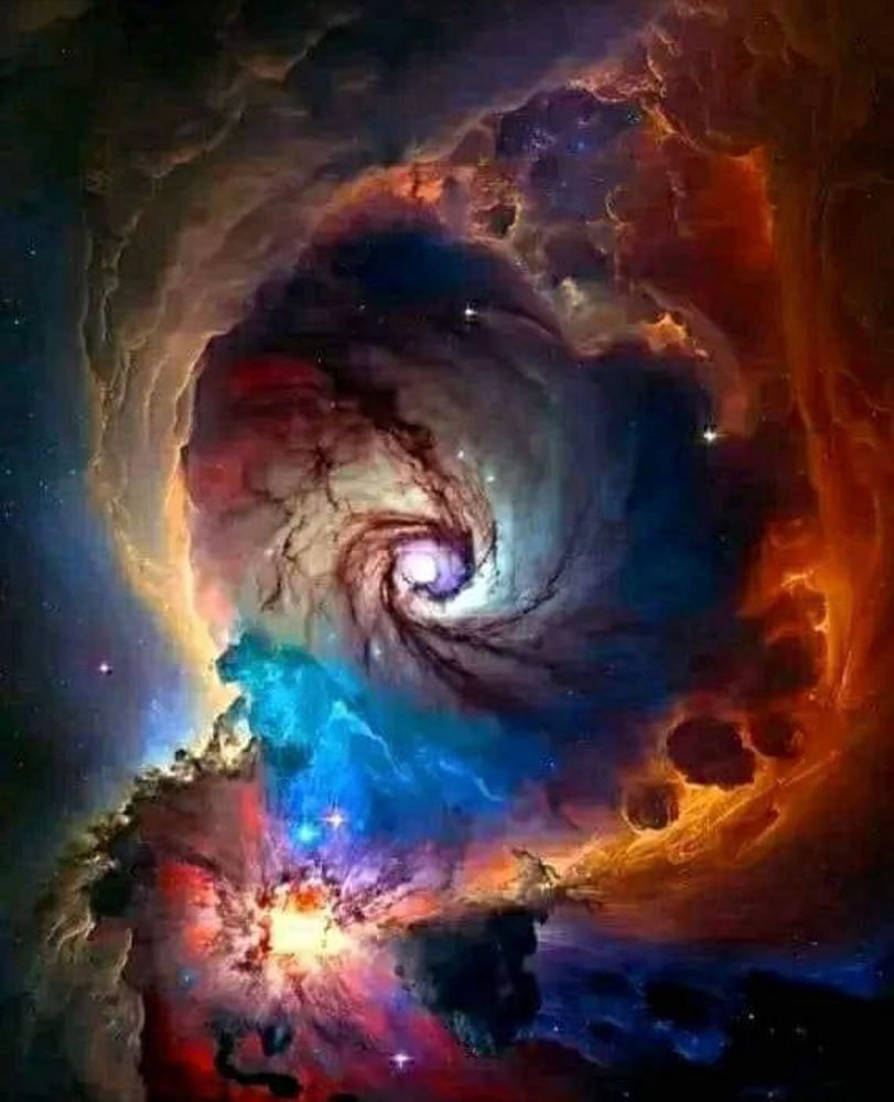
The next photo is of sublime star dust, taken through the James Webb telescope. Note the gemmy colors of star dust, tiny particles that have their own light refractivity. I love these photos for so many reasons and I’ll wager you do too.

Stardust

From the mundane to the sublime, we keep striving.

Love from the studio,
Diana

Christmas Earrings

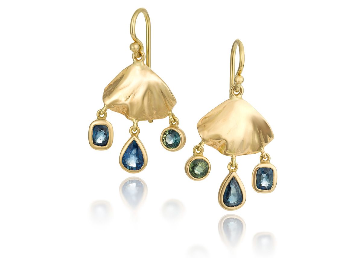
"I am still loving my gingko earrings and wear them most of the time. Someone asked me the other day if they were Christmas earrings because they seemed to be tiny dangling ornaments. Loved that, so now I will celebrate all year long with my Diana Earrings."

Light in the Darkness

While we are busy filling holiday orders and getting things ready to shine in forever homes, I wanted to thank each one of you for making my year full of light. I’ve been doing this now for 24 years and it just gets better with time because of you.

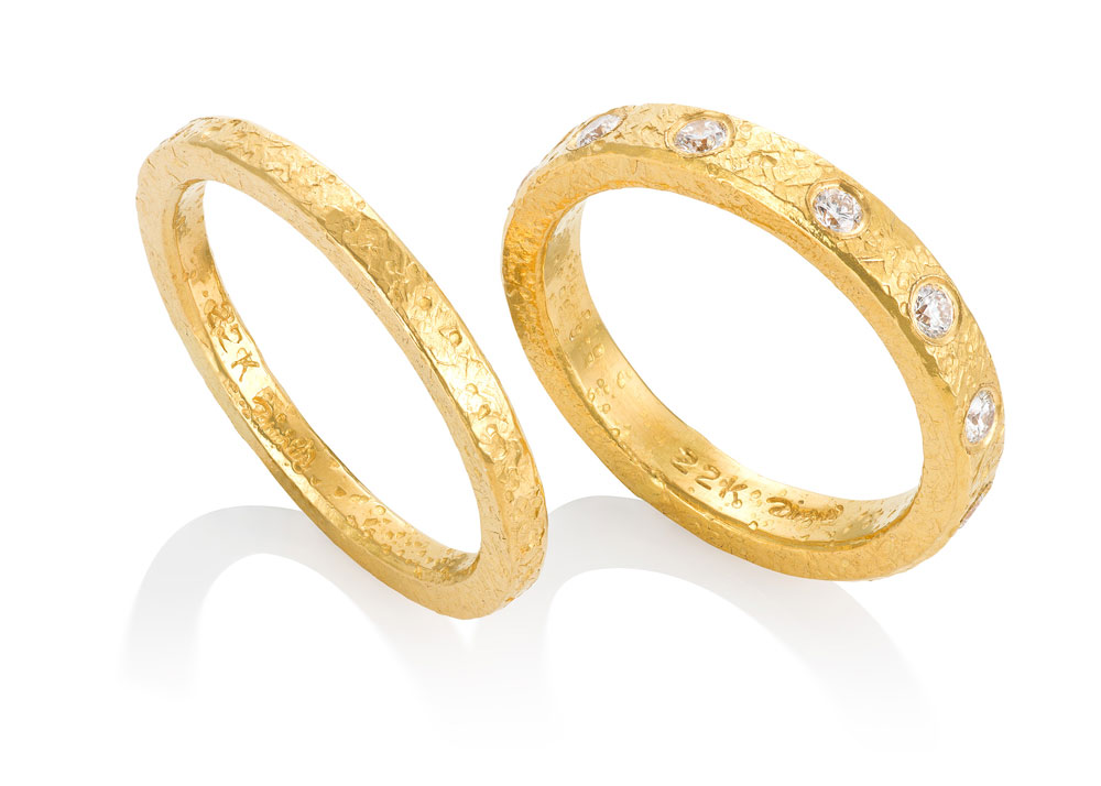
So many redesigned heirlooms, hammered pieces in silver and gold, pearls, pendants… all made with special attention and consideration of your needs and the stories you tell me.

Sending best wishes for a light-filled year to each of you, near and far.

Hugs from the studio…

DGrnSapPenNT web 22KRings web


Big Blue Marble Part 2: Down on the Farm

The life of a Tahitian pearl farmer demands persistence and patience during the 2 years of an oyster’s development into a pearl-bearing mollusk. Although the process is gradual and the farmers diligent, there is still risk involved. In general, after three years of growing, only 60% of a farm’s oysters will produce a pearl and out of that, only 10% will be round.

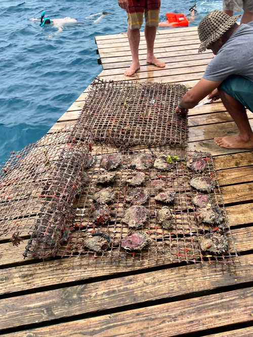
An oyster starts life as a tiny organism called “spat.” The spat babies take 1.5 – 2 years to become anything close to a potential pearl-bearing mollusk but once they reach that stage, they are strung on lines attached to protective grids and lowered into the water to begin their evolution. Pearl farmers lose many oysters to marine nibblers.

Baby oysters need about 1.5-2 years to mature enough to begin the pearl-creating process.

PearlOysterFarm2

Pearl farmers wash their oysters. When the oysters are pulled up from the ocean, they carry attached barnacles and other marine organisms. This muck is rinsed off and then they are lowered back to their watery nests.

PearlOysterFarm2

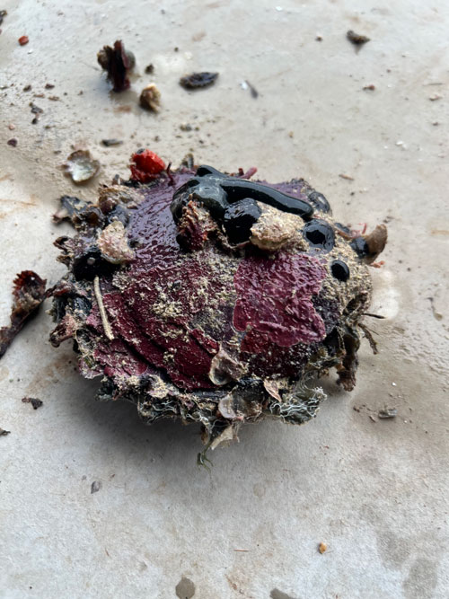
One farm told us they check 5,000 oysters a day to make sure they are healthy enough to produce. Sometimes, when shells are slightly opened, tiny crustaceans crawl out. These tiny beings have taken refuge inside the oyster to avoid predators. They are returned to the ocean to await their fates.

PearlOysterShell

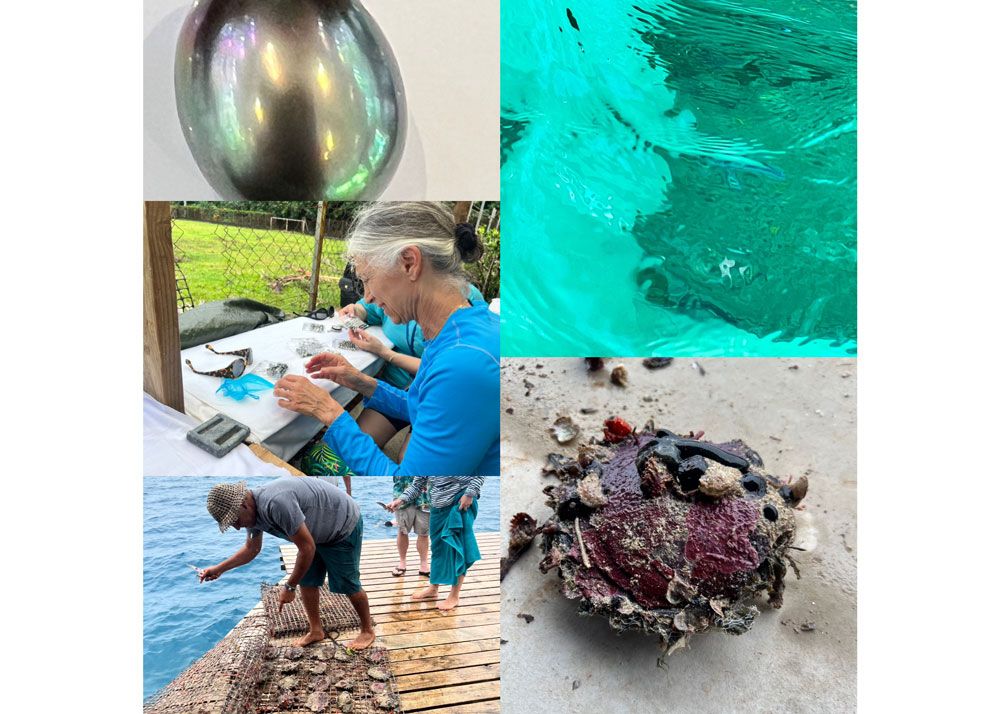
Tahiti and its neighboring chain of islands is blessed with pristine ocean water allowing farmers to produce the world’s most beautiful pearls. I’ve never seen such clean water and air. As you can see from the photos, the pearl colors reflect the vibrant hues of their above-ground native habitats.

One cool thing I learned was the pearl’s color comes from the inside of the oyster shell. That’s in the next installment.

Warm regards from the studio.

Diana

The Big Blue Marble and Ocean Gems

Earth has many nicknames… Mother Earth, Gaia, Pacha Mama, and “Big Blue Marble,” my personal favorite. Big Blue Marble celebrates the view from space (which sounds fun to me) while
toasting the crystalline blue ocean which covers 71% of our planet.

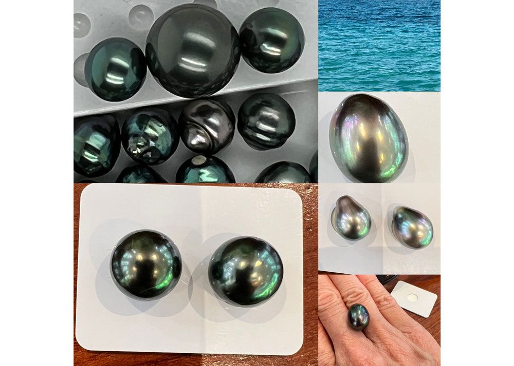
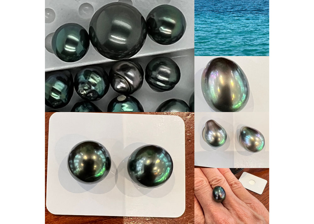
The Big Blue Marble creates some big (and small) blue, green, silver, black, rose, white, and golden pearls which often overlap in color. This creates never ending variety which was evident this week in my first trip to Tahiti to buy them. Choices are hard.

Although most if not all pearls used in jewelry are cultured, each one is a fine balance between human ability to help Nature along and the ocean’s blessings of mineral content for color, oysters, and tides.

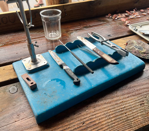
When you shop at a pearl farm, you feel the contrast between the labor of farming and the resultant beauty of the harvest. A pearl farmer must be patient. A pearl farmer washes his oysters. A pearl farmer uses simple tools and nimble fingers. A pearl farmer knows the value of their harvest. A pearl farmer is happy to tell an appreciative audience.

When you first see a pearl, you turn it slowly, and savor its main hue and subtle overtones. The nuance of color draws you in and tells a story. Even if a pearl is one color, its movement through light allows subtle tones to emerge. Pearls are entrancing and enticing.

Please call or text me at 312-346-2363 for a first viewing. There are some delicious, singular treasures.

Diana

TahitianPearlCollage